EXPERIMENTING: with sewing the book together

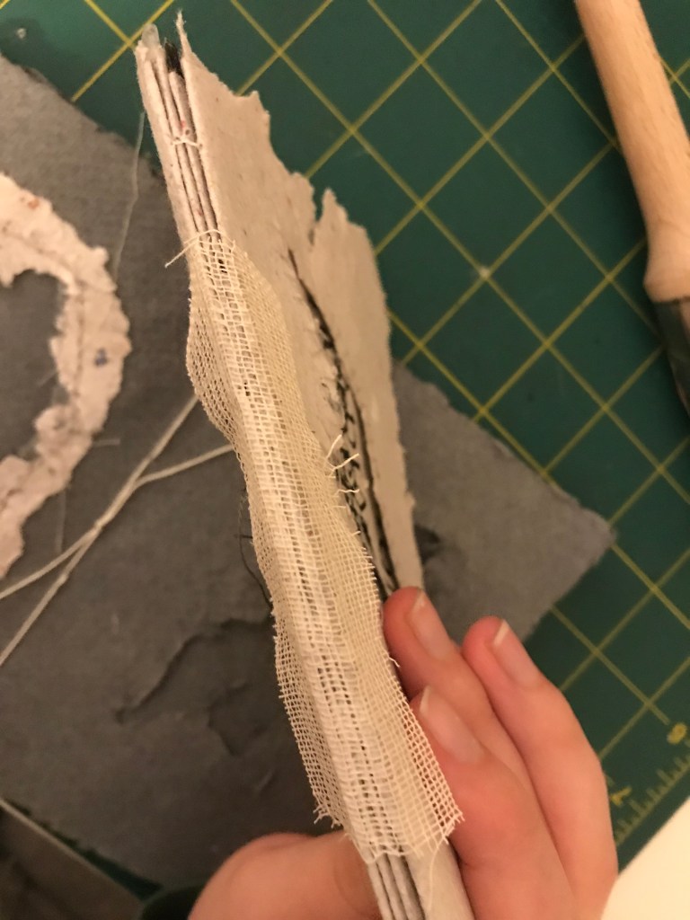
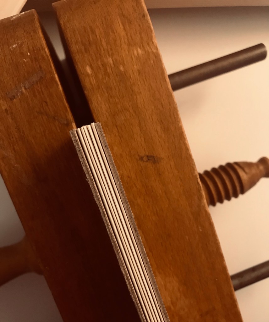
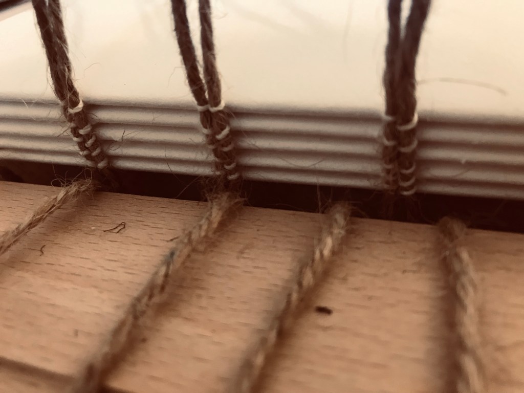
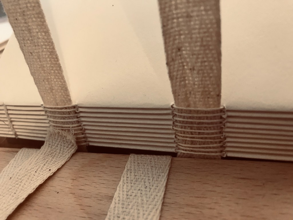
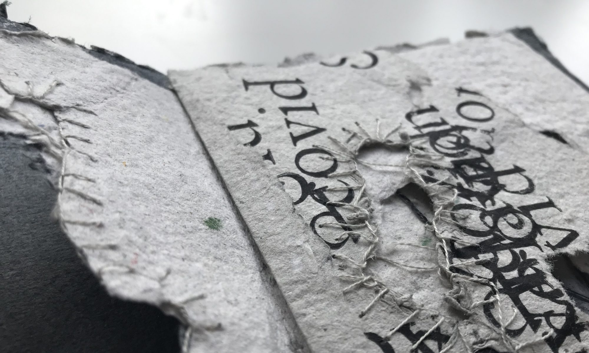
When it came to sewing all the signatures and tipped in sheets together I found I was hitting quite a few design problems due to the the way I had comprised the sheets and designed the book. the quality of the paper being thin, torn and fragile meant that I couldn’t use the tick linen thread I would usually use for binding that gives strength and stability and instead I had to use a finer cotton thread making the book block even more fragile. I also found sewing the tissue paper and tracing paper prints into the signatures tricky because of the brittleness. I designed a sewing pattern that allowed for all the sizings of the pages to line up and accurately be sewn together. I decided to bind it into a hard back cover as it gives it protection and strength as well as conceal the pages within.

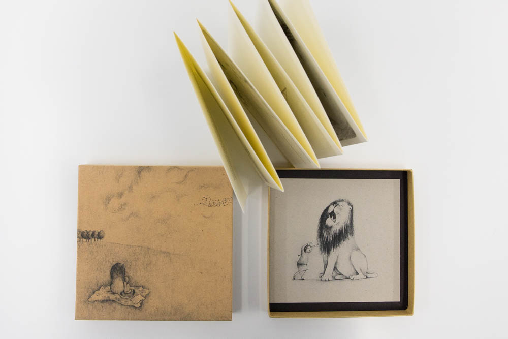
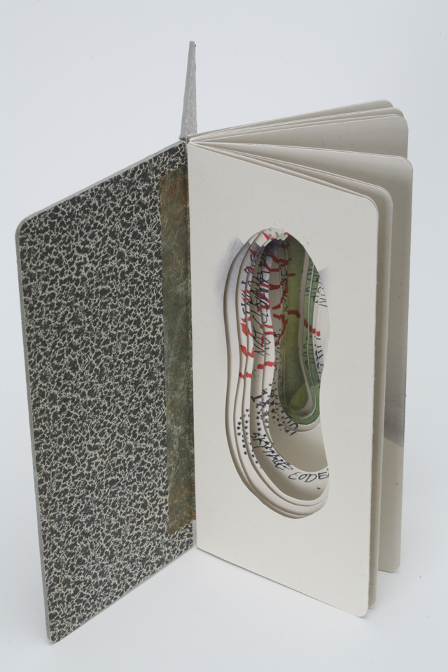
Making the hard back cover went okay but it was important that I was extremely accurate with measuring and cutting the grey board and the book cloth. I decided to use a more plastic looking book cloth that they have in uni , this is purely for the protection of the pages within. I decided on grey as it found it complimented the colour of the sheets within.

If I were to sew this book again I would consider the order and the way I sew them together prior to sewing then, I decided to combine concertina pages (that concealed translucent sheets with classic signatures making the actual sewing more challenging). I was hoping to take more images of the process but this part of making a book is some time critical that I forgot and i wouldn’t have had time before the glue dries.

PROFESSIONAL PRACTICE: Ether Connon

I came across Esther Connon when I was browsing through the online crafts festival, I then traced her back to her online website and shop. Her practice explores illustration and print through storytelling. She applies these to a range of ornamental objects as well and book forms. she tells stories primarily through drawing using little text. she now self publishes short children’s story.

Although her work or practice does not directly link to mine, it is interesting for me to look at how a book could be made in a professional commercialised context, the pricing and how Connon advertises and displays work for the public eye.

Although my works lends itself more to the work of Hedi Kyle where she produces book art as more of a collectors item focusing on unique and one of pieces made for the collectors market. It is important to consider both Commercial and collectors markets to see what the competition is as well as where my work belongs.

Esther Connon, Night Night Lily £20 handmade concertina book.

EXPREIMENT: material qualities

For my second artifact I will be binding a book as I am exploring vulnerability and isolation as a continuation of the bowl project I felt it was important to be using appropriate papers that express fragility.

I have spent this week making paper using newspaper articles. Making my own paper allows me to have better control over the thickness and quality. The material quality is something I am extremely interested in as it can influence how you feel or think about an object as the tactile nature if paper can influence the way something looks.

Whilst making my paper using a deckle and frame some of the best sheets were where the water pulp mixture had thinned out and the paper became more tissue paper like and very fragile with torn edges. This fragility represents the fragility and isolation of the old man in my video. when removing these sheets of the cloths that I dried them on I notices where the paper has not transferred a whole sheet small holes where in the paper. this made me think of the isolation and how I would represent the feeling. Layering these papers up creates an interesting composition as well as fragility and depth. I want to explore this further with my book form.

As a result I have been exploring and experimenting with how I could put a composition together and how I would best express this through a binding.

EXPERIMENT: drypoint printing the end papers

I wanted to make my endpapers for my final artifact a bit more interesting than just black hand made paper. I decided to etch a drawing on the old man. This man I have been using through my bowl, video and second artifact so I found it fitting that he should be placed at The end of my book. I wanted to make him seem small and vulnerable so I played around with the scale in order to find the best fit for the book block as well as the best size to represent the feeling of being small, isolated and vulnerable. In reflection this was interesting as I had trouble matching up the images and took me a couple of attempts to realise everything i was drawing and printing had to be reversed so that it was in the correct placement on the page. I think this was successful and a small detail that adds to the overall outcome of the book.

ARTIST BOOK COLLECTION AT UNI: meeting with Doreen

Due to the restrictions of covid I cannot access the artist book collection, but I wanted to find out more about it and organised to speak with Doreen who has specialist knowledge about the artist books. This meeting was extremely beneficial to me in exploring my ideas as well as expanding my knowledge and gaining insight into collection, as well as specific artist book artifacts.

We discussed book structures, the importance of the content and structure and how these work in unison I am quite interested in how the structure can inform the reader or create a journey that is personal and unique through the tactile form on a book and binding. I am interested in exploring a range of structures, but the one I am drawn to for this project is the concertina book, as this can be stretched out, double sided, sculptural, linear, you can also add additional pages that can be tipped in.

The qualities of a book structure allow it to be tactile, personal experience (immersive), allow for reader engagement through imagery, visual, interactive,fluid, allow for sensual interaction of sigh, smell, hearing and touch, the feel and type of paper.

Doreen was explaining the origin of the artist book, they came around during the 1900 when the artist book movement pushed to make art more accessible and this saw a rise in artwork being published and bound into book as a way of the artist becoming known. these were made by the artist and where usually part of a limited series or a collection but they can also be one off and unique works. These can also be published as part of an artist exhibition to explore the concept of work or can be a sculptural form in their own right.

EXPEREMENTATION: letterpess

This went wrong! first of all I had struggled a tray of type that had the letters I required and the sixing I wanted so I found myself spending an age finding the type. I found the type, and started assembling it into the frame. i experimented with printing onto tissue paper as i wanted this translucent quality within my book block, because of the overlapping effect I wanted i had to rotate the tissue paper ever time i stamped it and because of its catch the wind qualities it ended up moving onto the rollers and created a stippled printing effect on the page. Although this is not what I wanted to happen, its textural qualities were perfect for what I wanted to create for my book. so I decided to roll with it (!) and continue to use the tissue paper in this way and the outcomes were quite interesting.

EXPERIMENT: traditional book binding using tape and cord

Folding paper with a bone folder, to create signatures made up of 2 sheets of paper.
Measuring the stitch pattern, i then need to use the awl to punch the holes in the spine of the signatures to form the book block.
Using the finishing press to draw on the sewing pattern and press the sheets flat.
medieval cord stitch
Sewing on linen tapes. Using a sewing frame

RESEARCH: Hedi Kyle

Skytale Codes
skittle codes
Mica Flags
mica flags

Working from the knowledge of historical buildings, Hedi Kyle creates book forms that explore binding and foldings inspired by Kyles time as a historical book conservator. she explores how a book can be manipulated, folded and designed is a way that allows for new binding exploration and idea generation can create new structures. she is quite an important figure within artist books as she has developed a series of new structures.

I am interested in Kyles use of cut outs and light in the books above. This has given me inspiration to consider how I would best trap the elderly man within the book form. My ideas are to darken the areas surrounding the man to create the feeling of being overwhelmed within his own thoughts and negative space as a result of being exposed to the COVID 19 pandemic. This week I am going to continue to explore this theme through dry point printing and letterpress, and then folding and binding them into a book form. I am still unsure of the structure the book will take but this is something I will need to explore through mock ups as the material choice will be dependent on which structure I will use. Looking Forward to my final major I want to continue to explore these materials and processes with the intention of making artist book exploring these through alternative themes.

ARTIST RESEARCH: Robbin Ami Silverberg

IMG_20191007_143729--h.jpg
About Pearl, 2009 / Unique in a series of 5 / Archival inkjet on Dobbin Mill papers, embedded mica
Size: 9.5” x 7” x 1.25”

Robbin Ami silverberg artist book “About Perl” explores Silverbergs memory of her mother through the senses of touch. She selected materials that explore the sense of ageing in relation to her mother. this one off artist reflects a very personal response of the artist and the selected use of papers allows for an effective exploration of the development of an ageing skin without making it obvious, as well as allowing the audience to connect to the theme of the book through touching of the tactile form.

The combination of materials effectively emits the feeling of age, texturally the materials wrinkle bolge and creese in the same way the skin does as it goes through ageing. the binding of this book encloses the material textures within the book making the connection more personal and private when the viewer holds the form.

This artist influences the textural qualities of the paper and has made me consider the importance of the sense when making books, as they are tactile forms, usually with little text their impact and understanding by the viewer may differ altering the understanding of the form, therefore the form should speak for itself or should be free to interpretation.

SECOND ARTIFACT: design sheet

Design sheet explaining the process materials and textural qualities that i want to be involved with my second artifact an artist book. I want my concept to explore isolation by allowing the viewer to move through the book and pages that represent the layers of isolation and the way older people have felt trapped through this COVID19 pandemic both physically within the confines of their home and mentally. I have chosen to use hand made paper in this book as I believe it is representative of the brittle fragility of elderly people. this is also the same for the transparent crinkled papers. the stitching explores the same theme and pushes the idea of depth as it defines the layers between the pages. I am hoping I will be able to emphasise the distant loneliness by placing the isolated man on the bench at the end of the book so the viewer reveals him beneath the layers. this will be the end papers and the book will be concealed behind a hard back cover, potentially just saying the word isolation in letterpress.
Design a site like this with WordPress.com
Get started