 I attended a letterpress workshop to widen my knowledge of the facilities in the print studio and to equip me with the skills to print onto my work if I want to explore this further. There was a wide variety of typefaces available and if I were to do this again I would be more experimental with the type I use.
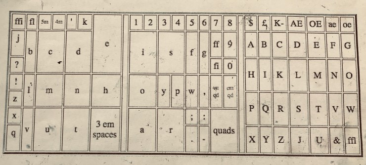
- Use frame and metal ruler
- Make sure lead is longer than the sentence
- assemble letters on ruler over the lead piece
- Notches must line up
- upside down left to right
- Spaces are shorter than text
- Piece of Lead on top
- Pinch the type between the lead
- Coins go at the top (things of lead with holes in)
- Fill surrounding gaps with lead and a slice of wood mirror it the other side
- Tighten the keys evenly
- Check the type is tightened in the frame
- Text should be flush- if not tap with a hammer with wood over text
- If doing more than one line of text use little spacers between the text and the words and lines
- Printing place gram in machine two notches on frame must line up
- Ink goes on top plate
- Use ink in guns with yellow handles
- Oil based ink – comes off white spirit
- Remove cap from ink squeeze onto glass roll evenly
- Roll onto printing plate not loads on plate
- Leave packing on frame
- Roll letters with ink pull handle down
- Lay paper
- Press handle until tight
- Don’t use paper that’s too big
- Ink will be really wet 2-3 days to dry
- Use white spirit to remove ink. white spirit is in can
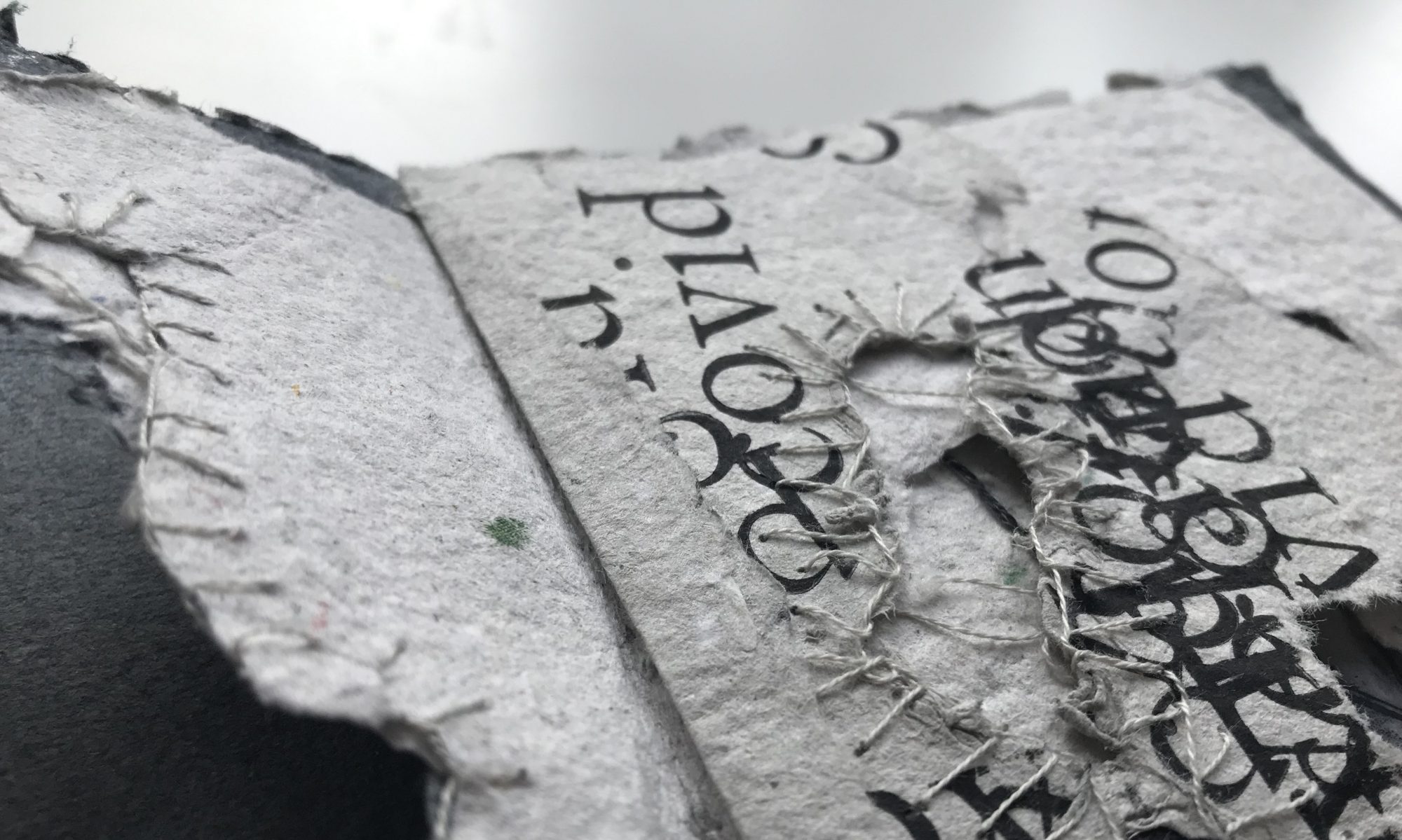
Problems I faced: I found this workshop and technique really challenging as you have to visualise the letters back to front and line them correctly. This took me a few attempts as I managed to get bs ds and qs mixed up. I was trying to spell my name. After several attempts I had correctly arranged the letters. If I were to do this again I would print the text back to front as a guide as it would speed up the process.
This is a really interesting technique with very satisfying outcomes. The print is not only aesthetic in itself as a perfect print it has a slight embossed effect on the paper making the type more prominent and significant this could have a really lovely effect on hand made paper.
